
Taproot Cafe
Client: Student Project
Objective: To create a brand identity for a fictional restaurant, with matching collateral.
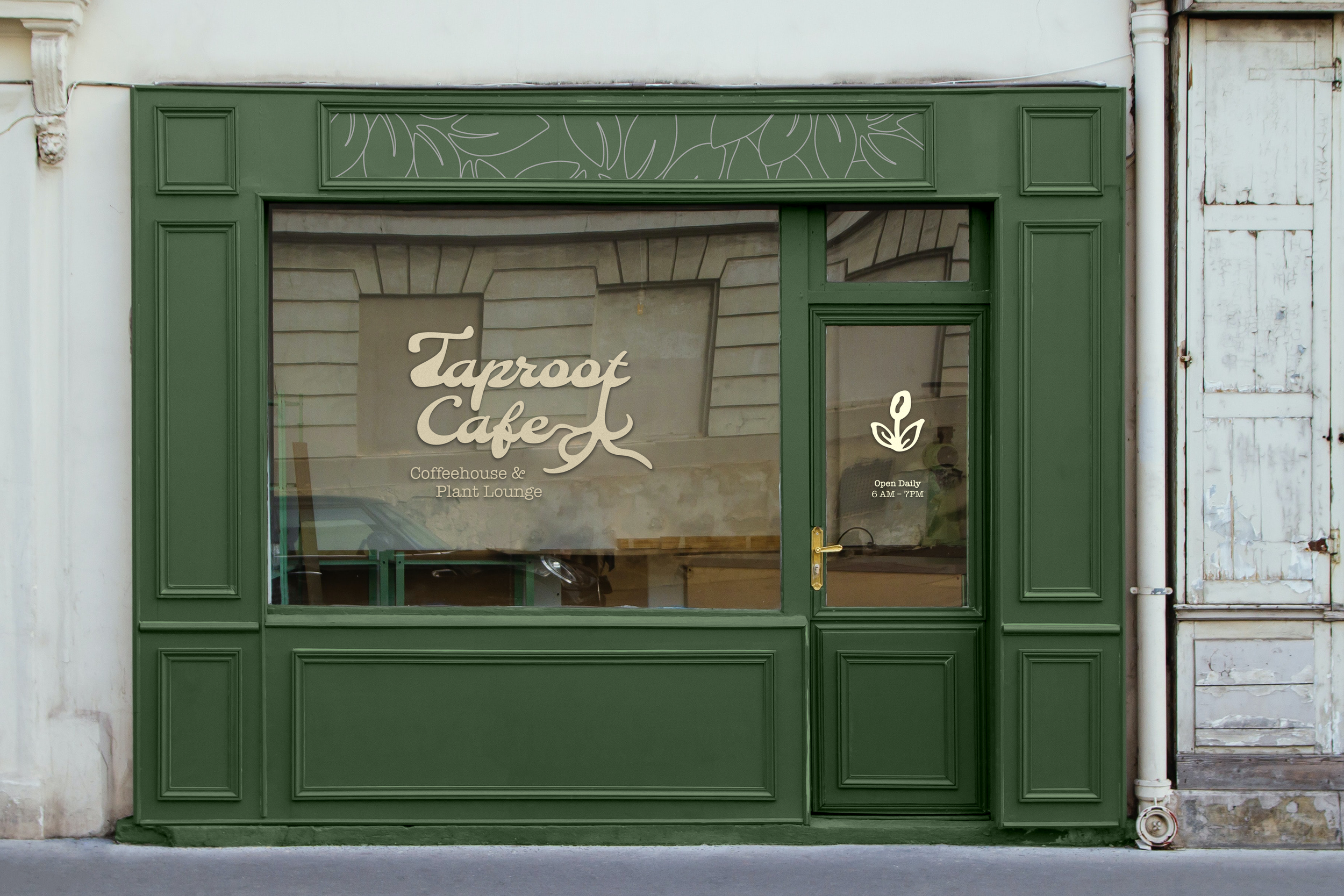
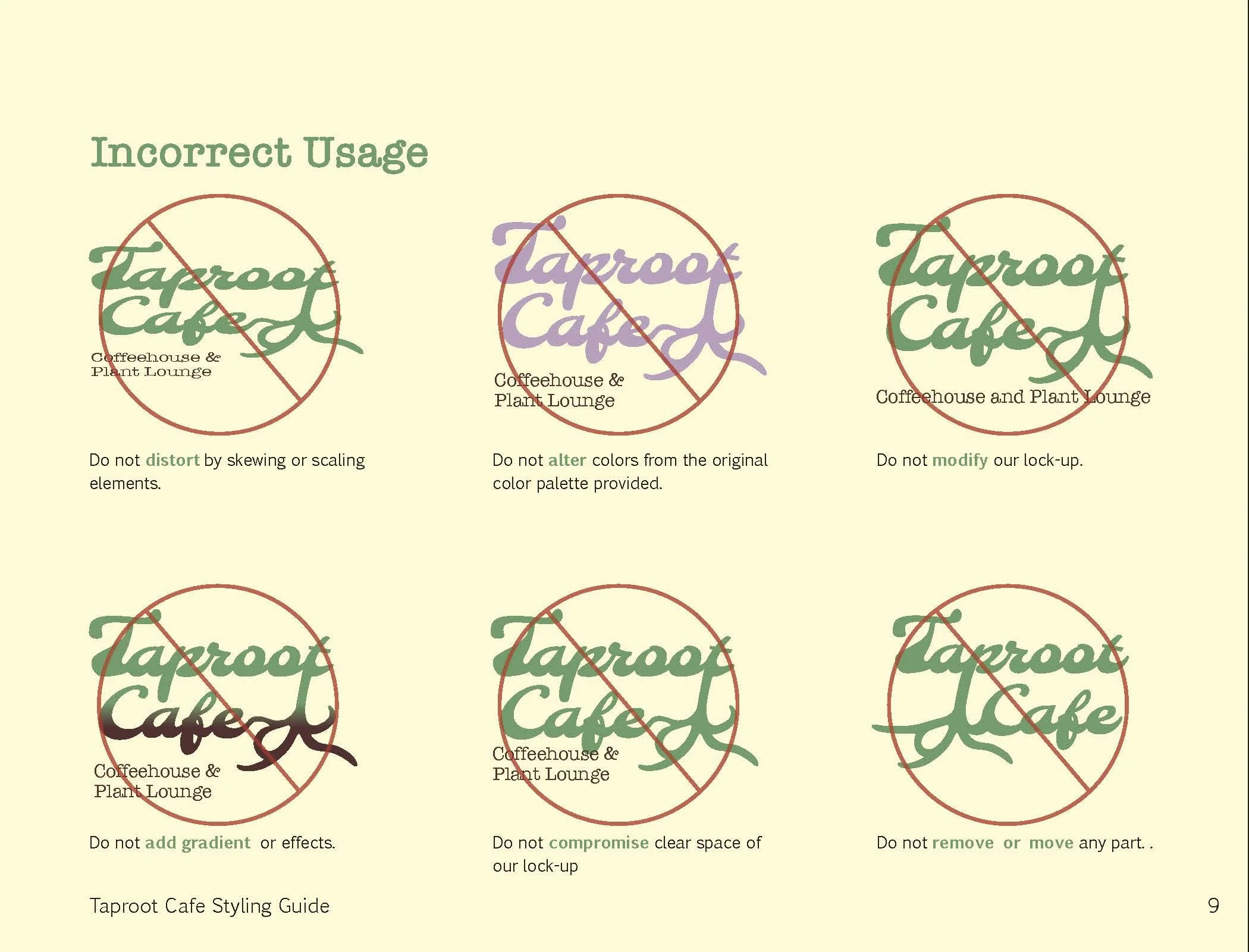
Solution: The brand I created called for calming, nature-based color palettes, so I used greens and yellows to imitate some of the plant species I looked at during my research. My main logo design is a balance of expressive script and studious type-writer typefaces, balanced out with an illustrative element of a plant’s root system, bringing a balance to the visual weight. I was challenged to find ways to incorporate a logo mark into the different collateral I created, and keep the brand identity cohesive and professional.
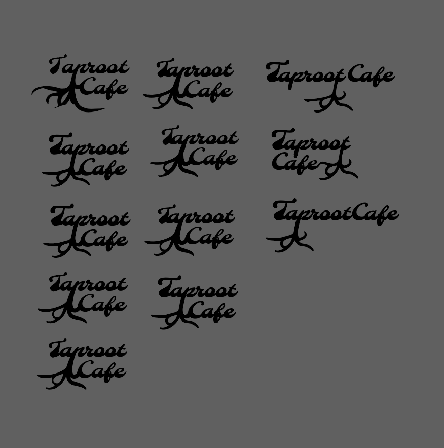
Initial Ideation
I was inspired by the plethora of coffee shops I’ve studied in to create a calming, plant-themed cafe that serves food items and specialty drinks. Initial ideation included choosing a name, and once I settled on “Taproot Cafe,” I wanted to find a way to include roots, an integral component of plant life, into the logo. Different layouts combined with the potential typeface proved challenging to balance, but after some experimentation and letter manipulation, I eventually came to a rough product of the final design here.
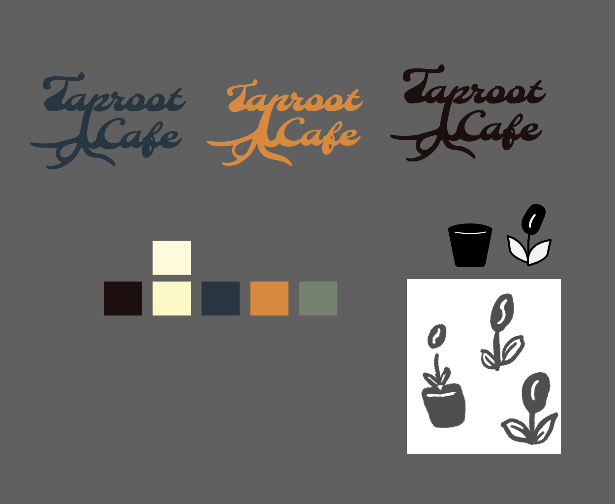
Incorporating Logomark and Color
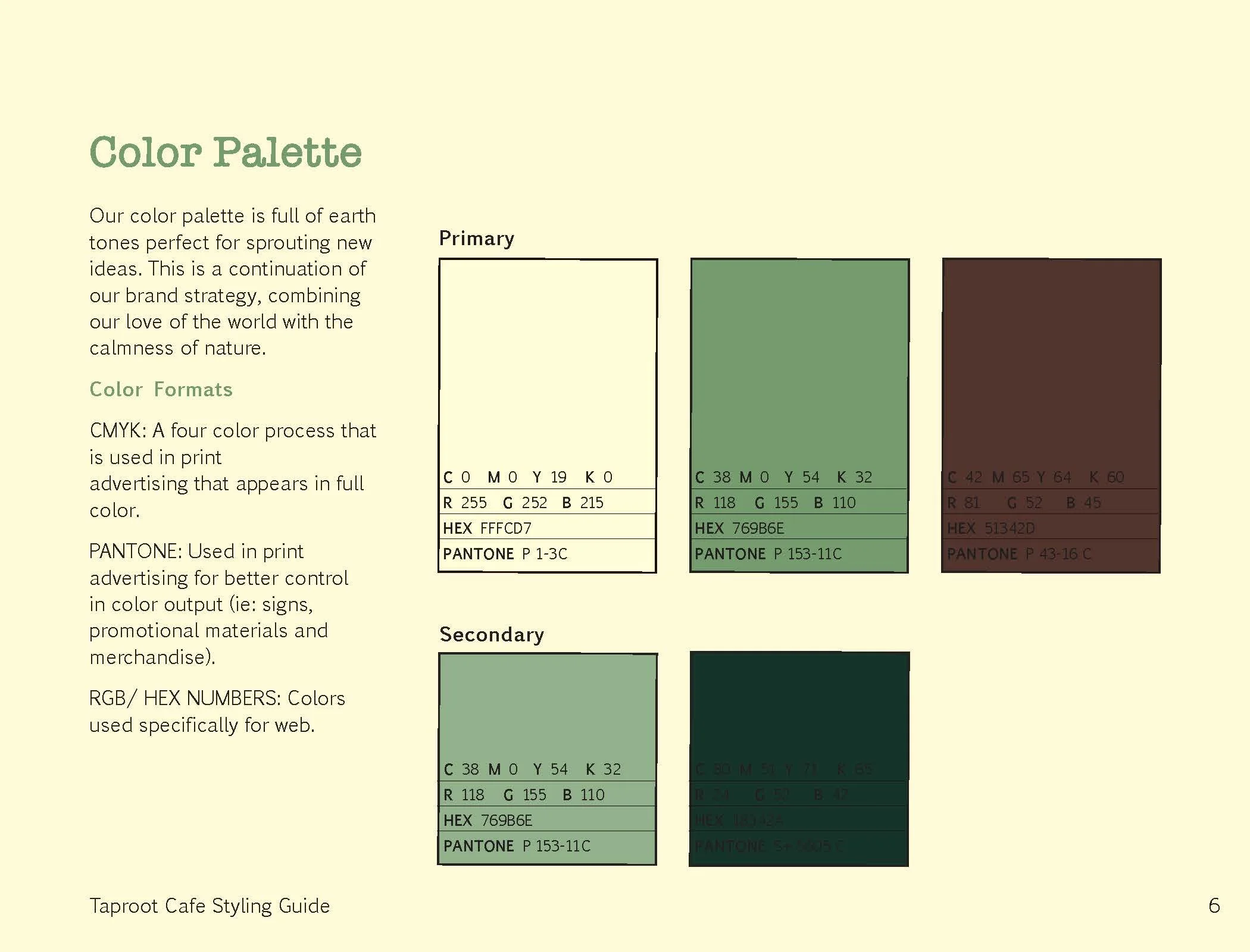
After settling on a rough final design for the logo, I began looking to color palettes that embodied the calm, studious space I was creating. Earthy tones, such as green, yellow, and browns immediately came to mind. I played around with other accent colors, but eventually incorporated a color palette that fit this cafe’s branding.
Knowing I would use a logo mark when appropriate during the mockup phase of this project, I got to work combining the ideas of plants and coffee. Since coffee comes from a bean that is grown, naturally I experimented with a coffee bean icon.
Logo Refinement
After experimenting with mockups, I realized there was still some unresolved balance issues in my logo. Adding a tagline providing more context in a smaller size helped balance the composition while providing the logo with much needed clarity.
Putting it Together — Style Guide
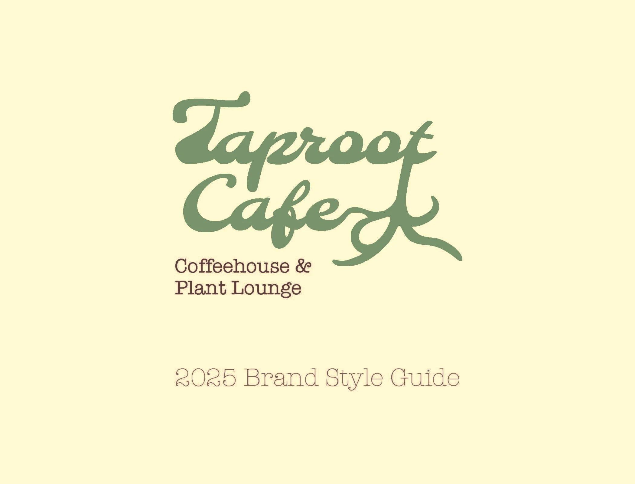
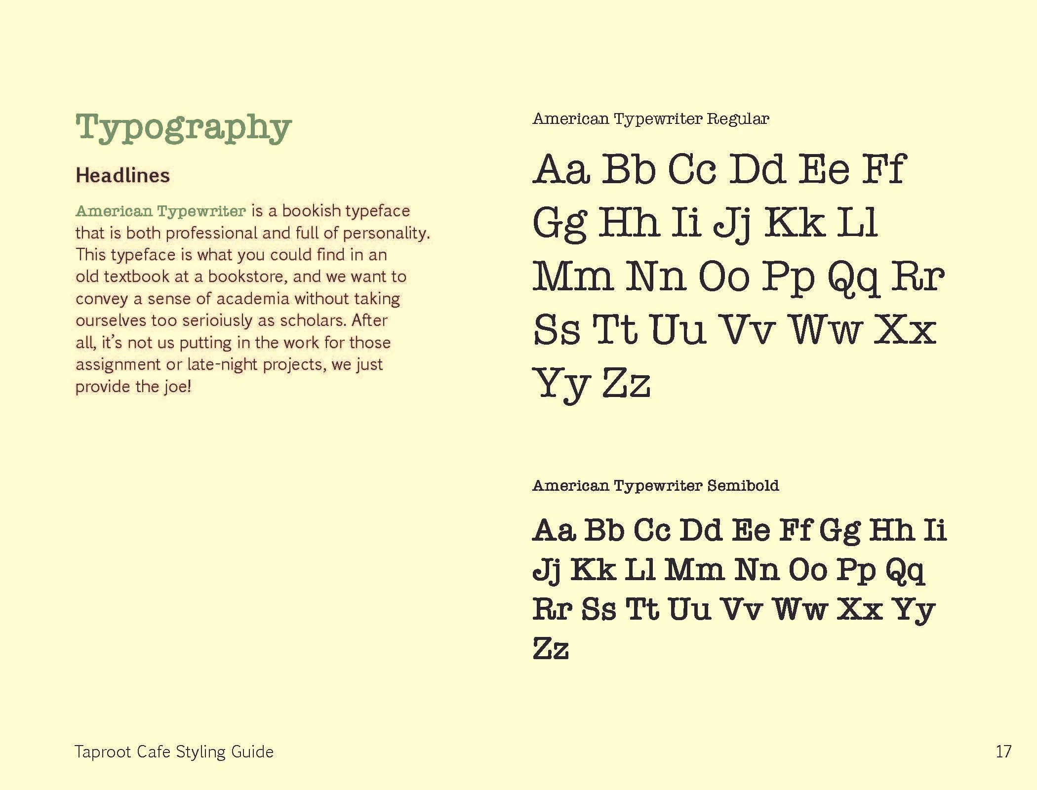
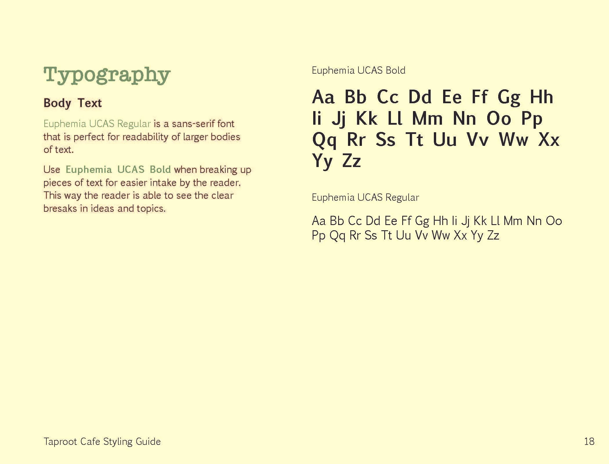
Part of the assignment’s requirements included an extensive style guide with color choices, typography elements, and more information about the brand identity.
Collateral
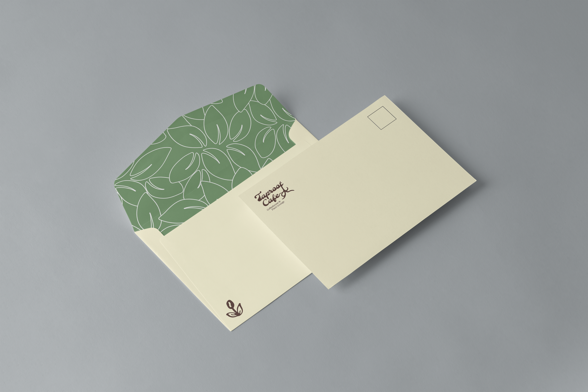
Envelopes
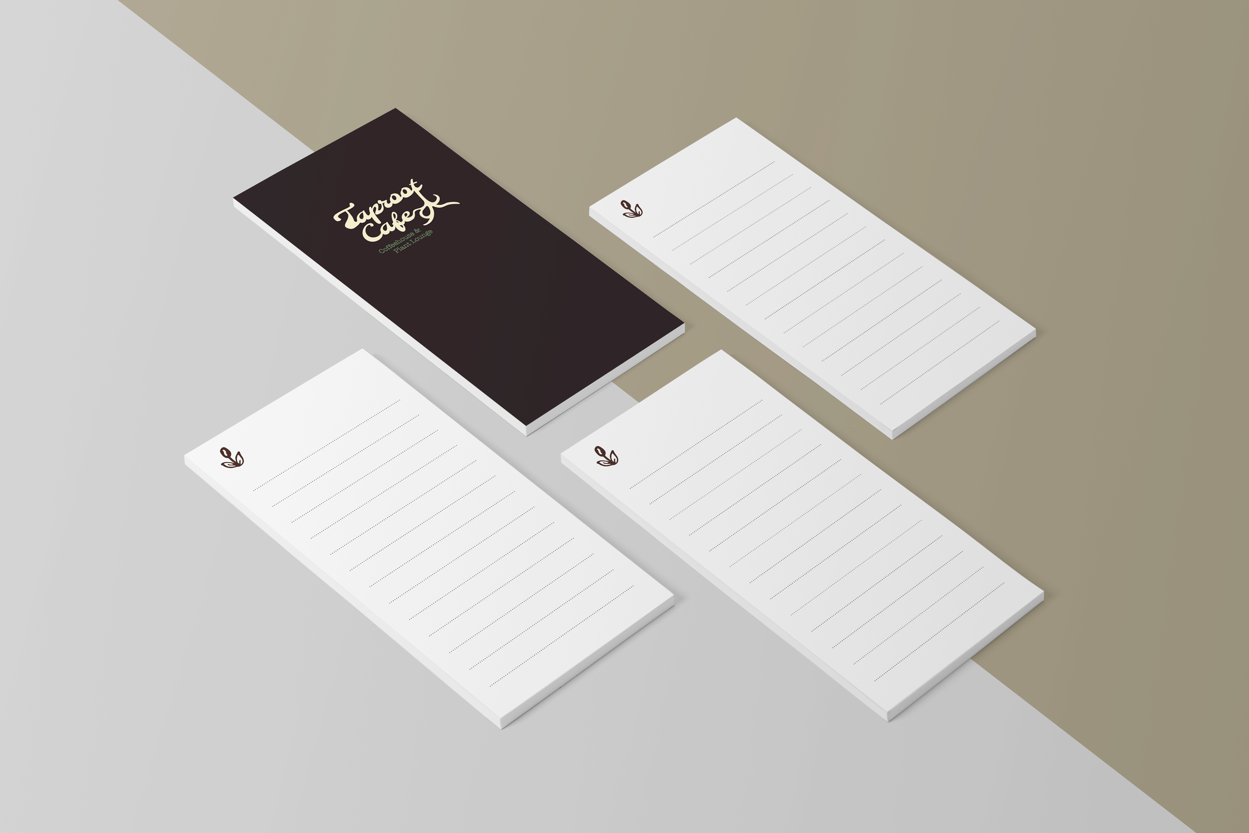
Notepads
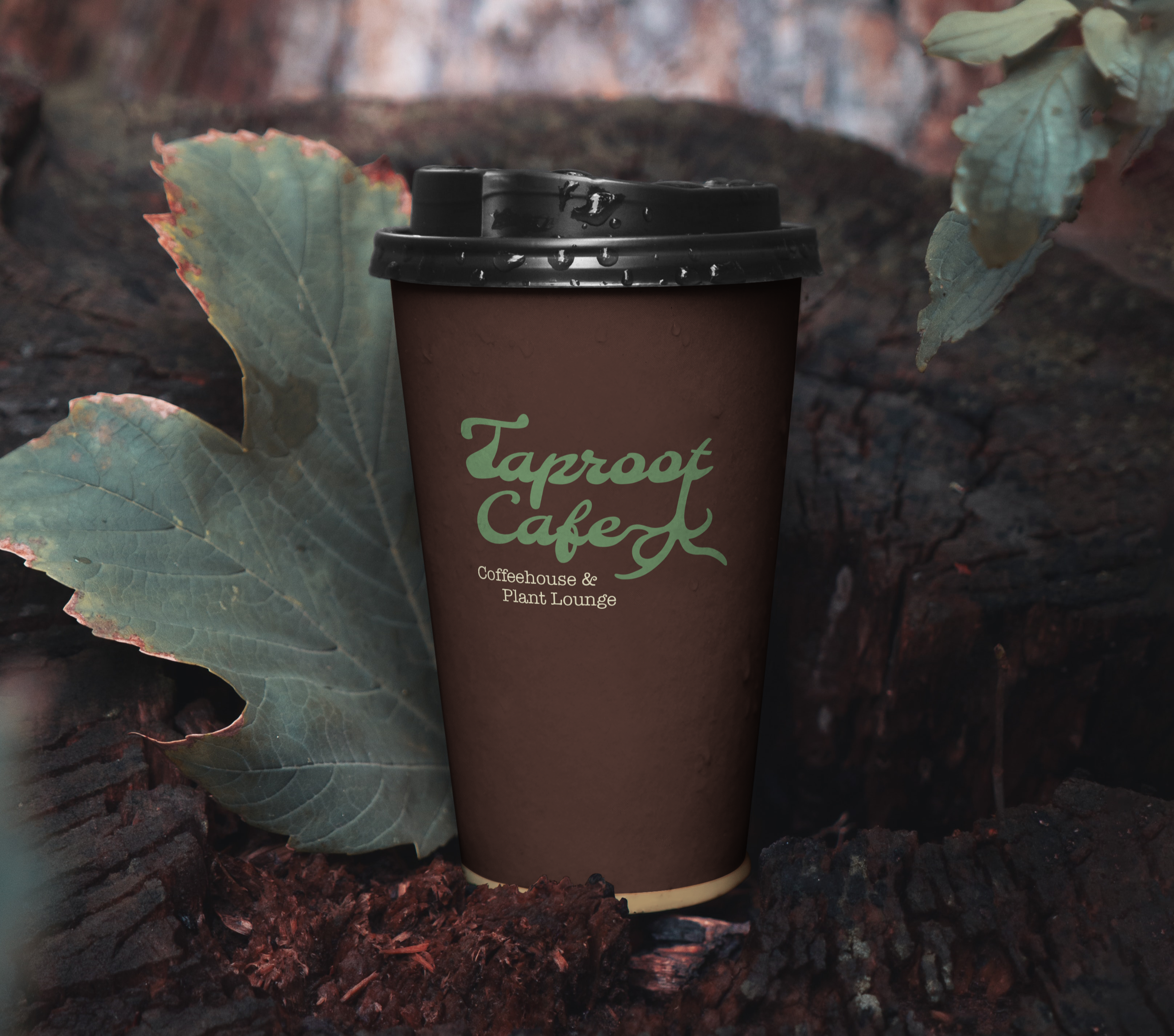
To-go cup